hurry up and finish the flower one so i can get my pen back. I would say work more on the realism of the mane of the lion, but its not your style, and im not going to force you to change something that doesnt need to be changed.
The first one seems kind of weak in my opinion, but the simplicity of the second one seems very professional and clean. Not sure if that's what you were going for but I like it.

I think you should try and incorporate flowers into the lion piece so it fits into your concentration
ReplyDeletehurry up and finish the flower one so i can get my pen back. I would say work more on the realism of the mane of the lion, but its not your style, and im not going to force you to change something that doesnt need to be changed.
ReplyDeleteI like them and wanna see them done
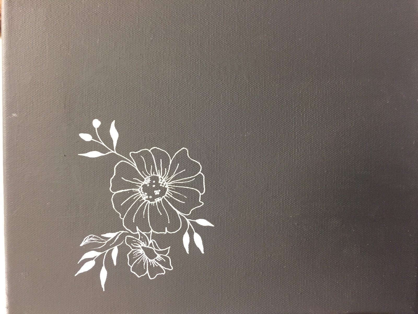
ReplyDeletei enjoy the contrast of white on black. nice composition of the lion
ReplyDeleteThe first one seems kind of weak in my opinion, but the simplicity of the second one seems very professional and clean. Not sure if that's what you were going for but I like it.
ReplyDeleteThe lion scratch board has more grayscale variation than the flower.
ReplyDeleteThese are both really cool pieces, I like how u decided to do white on black
ReplyDeleteI really like how much detail you put into both drawings.
ReplyDeleteLooks like a great start. Can't wait to see what else yu are going to add to the flower piece.
ReplyDeleteEggcellent
ReplyDelete